Rethinking the digital account opening system

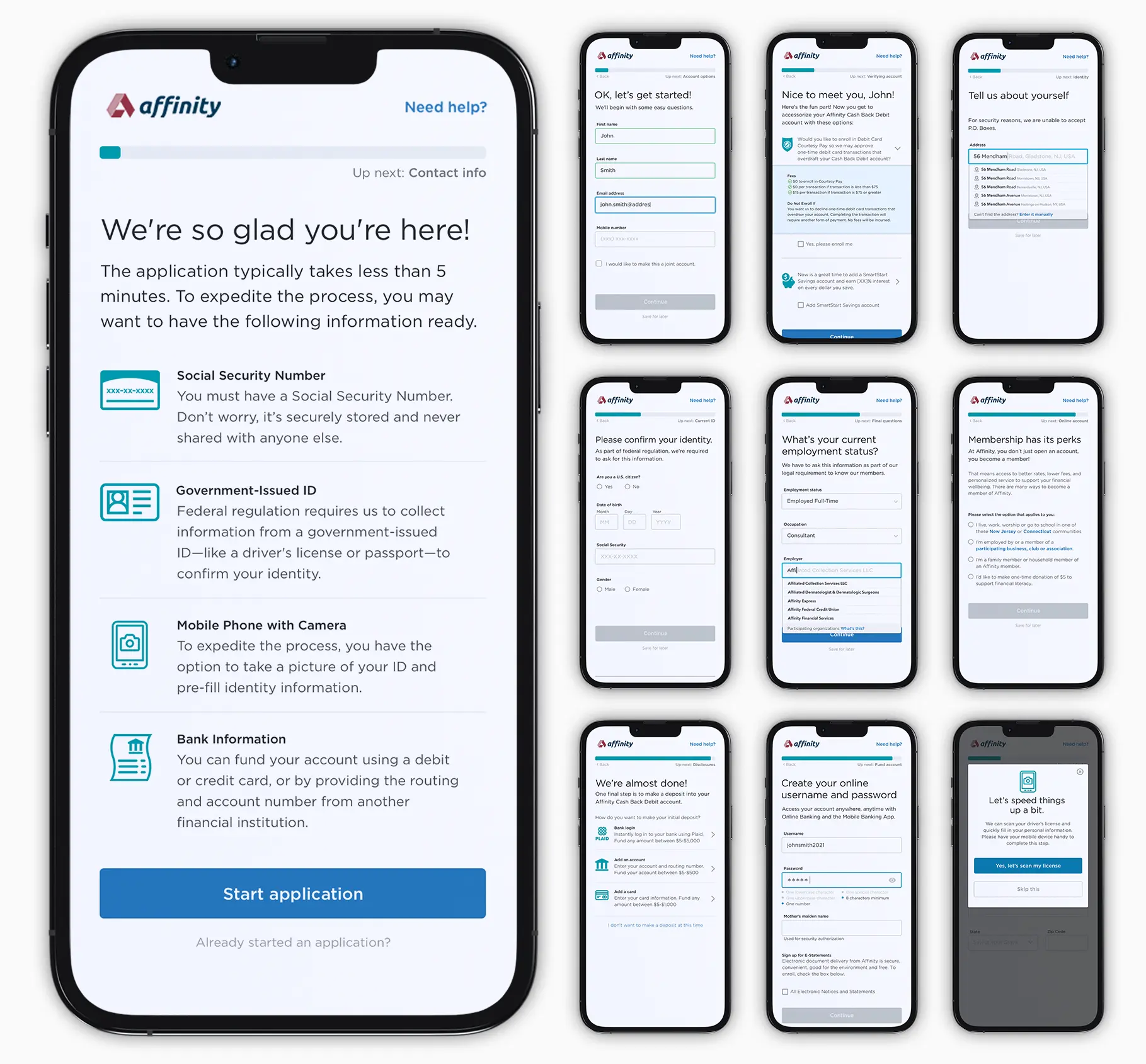
For many banks, digital account opening remains a difficult challenge despite all the investment in digital transformation. Even though digital onboarding remains a strategic objective for banks year after year—with 46% of financial institutions planning to enhance their existing digital account opening services in 2021—few are seeing tangible results.

Most legacy banks invested heavily in the technology that underpins new onboarding processes, but unlike the upstarts, have failed to rethink the processes themselves. That is why they are falling behind, and that is why customers are still failing to complete applications.

To compete with digital banks, Afinity needed to think beyond mere investments in technology and payment platform architecture. They need to focus on customer research and reconcile their internal processes with new customer journeys. That’s exactly what a solid digital account opening system is designed to accomplish.

Identifying the pain points

Affinity Credit Union had an involved and lengthy digital account opening experience. On average, it took applicants over 15 minutes to complete the process, though many were abandoning their applications prior to completion.

Applicants not only needed to answer over 16 due diligence questions, but also were required to upload a photo of their driver’s license to validate their identity—an additional step that was often exacerbated by technical difficulties. For younger audiences accustomed to quick and easy digital solutions, this process was arduous and more work than it was worth, leading to high dropout rates.

We discovered that

we were losing

35% of users

because our system couldn’t

identify the customer,

and a further

35% gave up

at some point in the journey

because it was just too difficult.

Approximately

15% failed

the process and only

15% made it

through to open an account.

Delivered a full onboarding journey review

To address the challenges Affinity was facing, I worked with their team to deliver a frictionless account opening experience with an intuitive funding flow, focusing on the following:

  1. An understanding of the current state of play in digital checking account onboarding and insight into where the market is headed.
  2. Recommendations on how to build a journey more in line with market best practices, considering both features and UI.
  3. A detailed breakdown of Affinity’s current journey and where the opportunities lie to enhance it or integrate new solutions.
  4. A view across the market of where best practices lie and how other brands are tackling the common challenges in the space.

Transforming scenarios into user flows

After determining our key personas, I created an overview on the user’s possible actions. These user flows focused on scenarios such as opening a checking account, or applying for a credit card, auto loan or mortgage.

Some of the key steps in the digital onboarding process:

  • Capture customer information
  • Validate identification
  • Generate account opening digital documents
  • Obtain the customer’s eSignature
  • Open the account in real time
  • Sign customer up for online banking
  • Issue and mail bank card.

A phased approach was recommended to minimize forms and cognitive load by keeping decisions bite-sized.

Some of the best practices that were followed:

  • Used a “Mobile First” design. Completing transactions on smart phones is all about speed and simplicity. Therefore, we minimized the use of keyboard input by utilizing drop down lists, toggle/radio buttons, and the photo capabilities of the mobile device to assist in data collection. We also minimized white space and used adaptive design to eliminate unnecessary images/graphics when rendering on a smartphone.
  • Collected the easiest information first. Asking for the basic information first (name, email address, and phone number) not only engaged the user with the least amount of effort, but this information also allowed us to retarget abandoned applications. Importantly, we asked only for the specific information required and nothing more.
  • Onboarded for the requested product only. We resisted the temptation to market or inform the consumer about ancillary products or services until after they had completed the application or account opening initially requested. After the primary product or service had been opened, additional cross-sell or upsell suggestions were then provided.
  • Verified input frequently. Inline validation was a must and ensured all required data was gathered with no mistakes, preventing users from experiencing difficulties during onboarding and receiving irrelevant feedback.

My final contribution to the project was to create a high-fidelity prototype of the account opening user flow. Stakeholders benefited from this stage for the following reasons:

  • Meaningful feedback. The prototype provided meaningful feedback during usability testing since participants could interact with the prototype naturally (as they would with the final product).
  • Testability of different elements and interactions. Test specific interactions such as animated transitions and other micro-interactions were easily tested.
  • Accurate product view and expectations. All stakeholders were provided with an accurate view of the final product.